League of Legends Masters Studies, Pt1
2021-02-10So I ran out of commissions, which is a fairly rare occurance. (I’ve been working a solid 5 days a week for an hour and a half in the morning on stream since probably the middle of last year.)
That means I had to do the thing again where I desperately try to find something to work on for the forseeable future.
As per usual. I didn’t really have a plan until the morning of the stream where I didn’t have anything to work on, so I was forced in a moment of pure panic to put down the guitar and figure out what to draw for stream that day.
Coincidentally, Liz and I also recorded a podcast titled “Practice Sucks and I Hate It” which will be out some time at the beginning of April.
Now this is probably the third or fourth time in the last couple of years that I’ve tried to invent a new practice routine that will actually make me practice but none of them have stuck. The podcast will make more sense of that when it comes out. But suffice it to say that I loath practicing, because it focuses on the parts of drawing that I suck at, and forces me to confront my suck. And since my progress is slow, it’s a lot of slow suck that sucks.
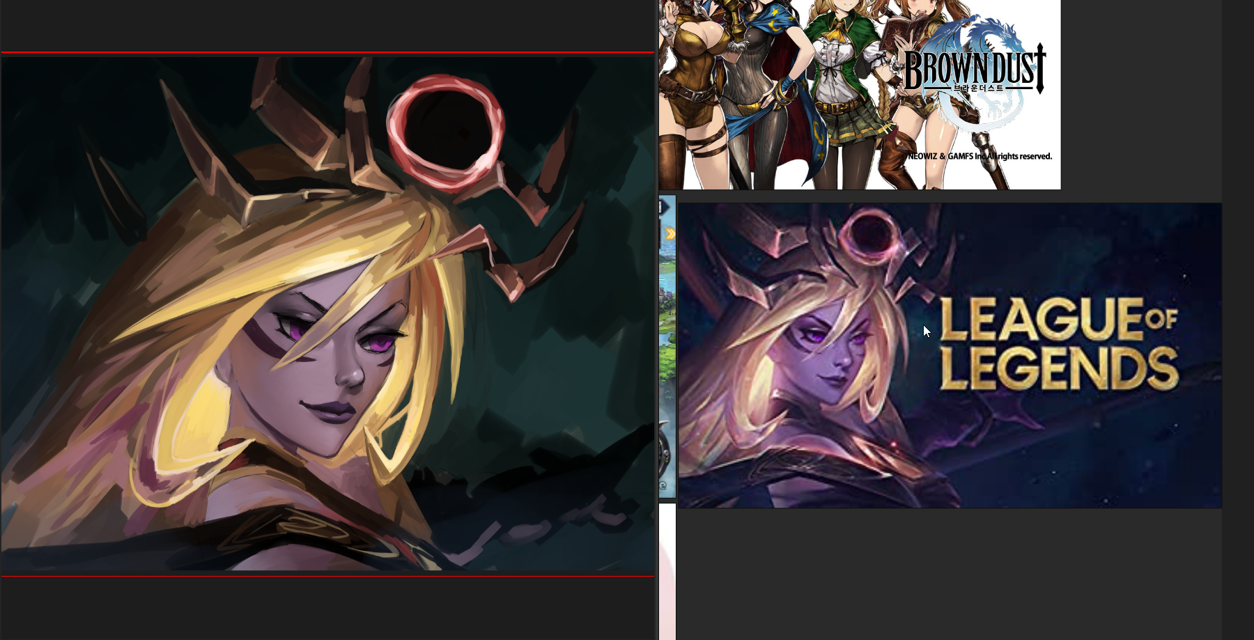
But in a fit of desperation, I popped open my PureRef document for Chinese mobile game art, and in there was a single snapshot from League of Legends. I had a flash of “Aesthetic Yearning” (another topic of our podcast, which will be out in late March).
So I just cropped in on it and started a masters study.
A master’s study is a kind of art practice where you try to mimic the style and content of an existing piece you admire. Usually it helps to pick a piece that’s extremely high quality, so that you can learn as much as possible from copying it.
It turned out to be a good strategy for several reasons:
- I didn’t hate the final output. I’m pretty okay with these pieces as practice pieces.
- The struggle was specific enough that it felt a little more like a game than “work”
- I learned a hell of a lot from each one
- There’s a shitton of good LoL artwork to work off of
- Fousing on a single piece for an hour and a half doesn’t leave me feeling like I suck because I got to polish the piece a lot more than 20 shitty sketches
So let’s take a minute to look at what I did and what I think I learned.
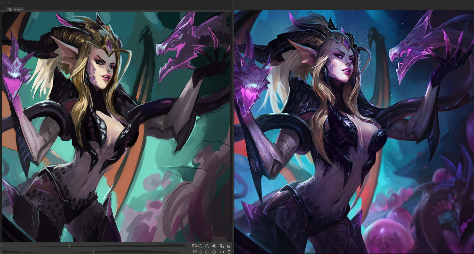
Original artwork by Riot Games on the right (and slightly larger), my study on the left (and framed by the Clip Studio Paint preview chrome)
Monday
- Critique
- Colors of the background are off quite a bit
- Didn’t much care about the shape and position of the horns
- obviously gave up on the arm & spear/staff
- eyes are slightly slanded wrong
- glow effect in the hair not accomplished to satisfaction
- What I learned
- 1.5h masters studies are fun and don’t suck
- good surface texture comes from many chunks of different colors
- subtle surface hue shifts are great
- color is way more boss than Value-First painting would have you believe
- a new face shape for stylized female faces
- noses are hard
Tuesday
- Critique
- OBVIOUSLY bit off more than I could chew in 1.5h
- fucked up a section of wing overlap on the left side of the piece
- exact same color shift from previous piece. Do I need to color callibrate my monitors better? Or am I seeing wrong?
- face tilt is way off, chin is bad
- What I learned
- I’m not great at seeing colors
- pick smaller scope
- black is a fucking hard color to paint, jfc
- I’m not great at tilted faces
- dark gold/brass is cool and hard
- go to town with rim edge highlights
- edge highlights are NOT THE SAME as rim lighting. A dab’ll do ya
- don’t sweat the background
- blond hair is difficult. what even is color?
- noses are hard
Wednesday
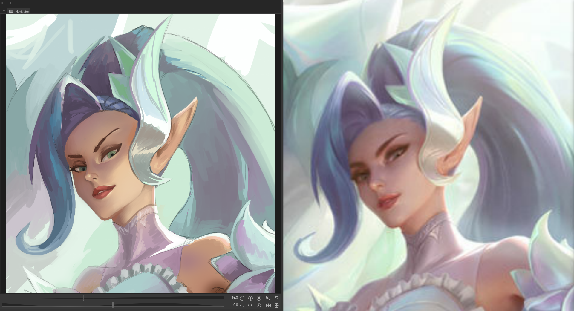
- Critique
- color variations aren’t quite there
- skin color is still a bit sallow
- cheek curve isn’t quite right
- shoulda run another stroke of white airbrush pver the top pf the hair
- ruffles not really attended to
- edge of hightlighting could use some work
- What I learned
- spots of -self-reflected color have intense saturation
- subtle hue shifts are super hard to match, but look great
- drawing got better when dealing with a smaller area of the image
- copies like this are much easier to do thanks to using the edge to find reference points
- noses are hard
General Thoughts1
- this whole process is a lot more enjoyable than 20x sketches
- manga style images are hard to duplicate/study because they’re so stylized that there aren’t as many reference points (including color shapes)
- I’d be comfortable rolling more of this style into my own art style for future commissions
- There’s a lot of neat character design stuff going on in this kind of video game art that I don’t get to do generally in D&D commissions2
- this seems to be really showing me a lot of stuff I’m not used to seeing or doing
- I really hope I can internalize some of it in order to actually keep some of this knowledge
- might have to keep putting LoL reference in all my reference packages for all future commissions for a while, to really focus on the style
- Need to do a podcast talking about practicing art as obsessively as some children do
- Check out the Joe’s Table Podcast
- noses are hard